


I always loved making these, a great excuse to be loud and bold to get attention. I designed many sale posters for American Apparel but this is my favorite series.
This project will always be special to me. I spent 6 months developing every aspect of this sample kit, from the size and material of the pieces to the layout of the tear sheets. I pored over every detail from the color of the rings to the placement of the retaining elastic (with plenty of prototyping, user testing, and r+d). It was a tremendous task and I loved meeting with all of the fabricators and paper mills and die cutters etc to get all the components made in a beautiful and economical way.
When American Apparel needed to print something to display in store the standard size was 11x17, other than that I had room to explore typography and hierarchy in several languages for these.
This project was really important to me and a big responsibility. I loved being able to bring such a worthwhile message to life in The Wall Street Journal and Washington Post. The census count affects everyone, especially traditionally marginalized communities.
I got a brief from the CD at Traeger that they wanted to update the styling of their shipping boxes for the flagship machines so using their reference points I developed a higher end look to refresh what they had. I took inspiration from high end music instrument shipping boxes mainly and created this new set of line drawings.
This was a self published book of haikus I have written paired with a series of photographs I took while staying on the coast in Grayland WA. The juxtaposition of the moody photos and the ample white space and sparse type lend a really pleasing reading experience to this project.
This was the second album layout I designed for the Jake Marsh Trio. Their first album was a little more raw and folksy and I ended up doing a series of illustrations for that project. This album felt like it called for a more subtle and photographic approach. I took a series of street photos around Seattle at night and used them as the foundation for this piece.
I love stickers, period. Coming up with a bunch of fun and colorful designs for Epic was really fun and this sticker sheet is great to throw in a thank you card to clients or handout to employees.
Small sample of packaging I developed for Guild Guitars including shipping boxes, hang tags, and folded packaging. This was right when ownership of the company transferred and I had some freedom with vintage logo marks they were looking to reincorporate.
I really enjoyed laying out this pamphlet, it was a standard problem of lots of info to get across but the nature of this business allowed for me to really play with large imagery and use plenty of white space to help offset the dense material.
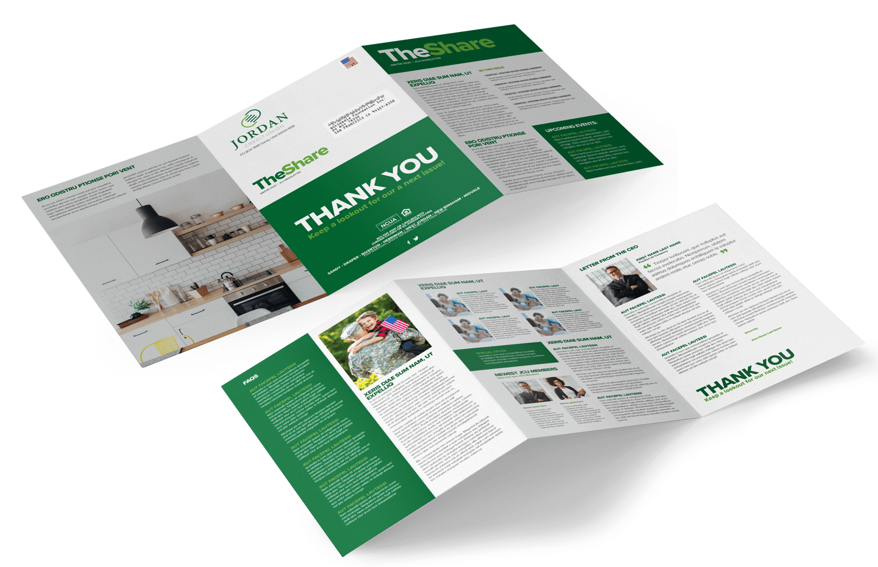
I was the art director on this project to create a template for a local credit union that they could utilize for future editions of their newsletter.
I had the opportunity to help art direct this product catalogue with another designer, overseeing layout details etc. I also contributed to the photography by taking images and processing others.