


I worked with the founders of this apparel company and really aligned with their mission to plant 5 trees per item sold. I stayed in the green family to reinforce their eco friendly values and I included the Roman numeral V as a nod to the 5 trees promise and to subtly repeat the name; tree+V=Treevy.
Loved getting to work with 425 Fitness from my adopted home in the Pacific Northwest. I did lots of work for them including a full suite of rebranding and environmental graphics. This logo in particular was fun to branch out and play with the shapes, angles, and colors.
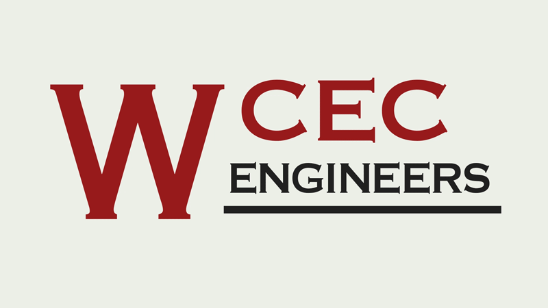
I had the opportunity to work with the founder of this engineering firm and help them retool their identity. It was super interesting doing a deep dive into that industry and after all the R+D this clean and modern mark was born. I went on to develop the entire style system for them as well as art direct their website.
Met with the creative director of Traeger, which was a company I already loved, and had the opportunity to work on some ideas for packaging, apparel, and swag like these stickers and patches.
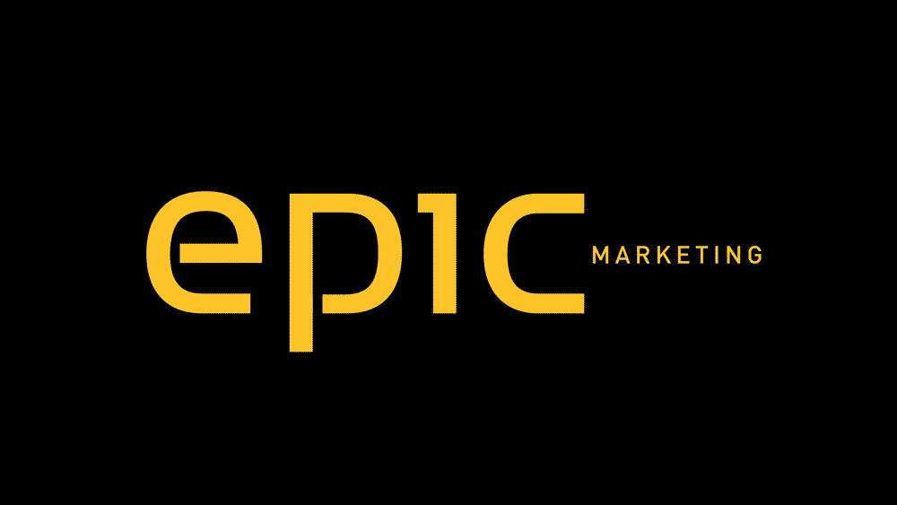
This project was really fun because I love giving new life to existing brands and Epic Marketing Agency had good bones to work from. Cleaned up the shapes, brightened the colors, and ditched the word “marketing” to give them a bold and clean new starting place. This was a motion test I made to show the change.
This was a super fun one, a little different style for me. Developed this word mark to really reflect the handmade nature and heritage vibe of this leather goods brand. It looks great stamped and engraved into these awesome pieces.
Really liked working with CrowdStorage, the founders are super nice and super smart. Their new cloud network system of storage is super interesting and I liked learning all about it to inform their branding system. The logo uses the forms of a C and an S to make an interlocking form illustrating the way the platform functions by linking users.
How could this not be fun? Got to rebrand a fun center who’s biggest claim to fame is their massive trampoline park (which I did plenty of R&D at). I used the movement of the jumper with the arc on the type to show bounce, movement, and of course fun.
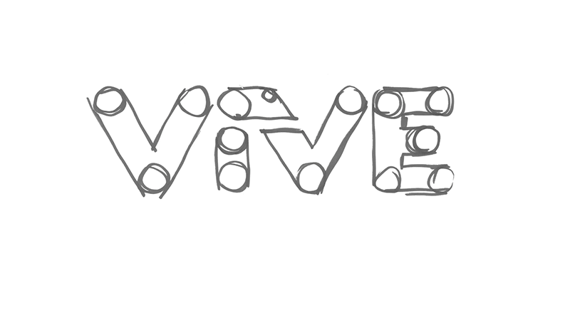
This fintech company has a long and interesting backstory which I really had fun researching. Also got the opportunity to test these logo versions at focus groups which was very informative. We took the old boring name and logo and literally injected new life (vivé) into the brand.
This was a logo made for one of my family reunions, couldn’t help but brand the whole affair. I love researching and what better subject than family heraldry. There was a lot of really interesting symbology and meaning to mine from and I am really pleased with the result.
I developed this icon set to represent the company value statement for a local credit union. They represent the words Purpose (compass), Autonomy (feather), Love (heart), and Mastery (archery). I noticed they form an acronym for PALM and the credit union’s branding includes a logo of a handshake, very serendipitous.
This was a great client to work with, I had lots of freedom to explore. I used a strong and clean typeface to set the tone and utilized a series of triangles to resemble mountains, the letter M, and part of the spine.