
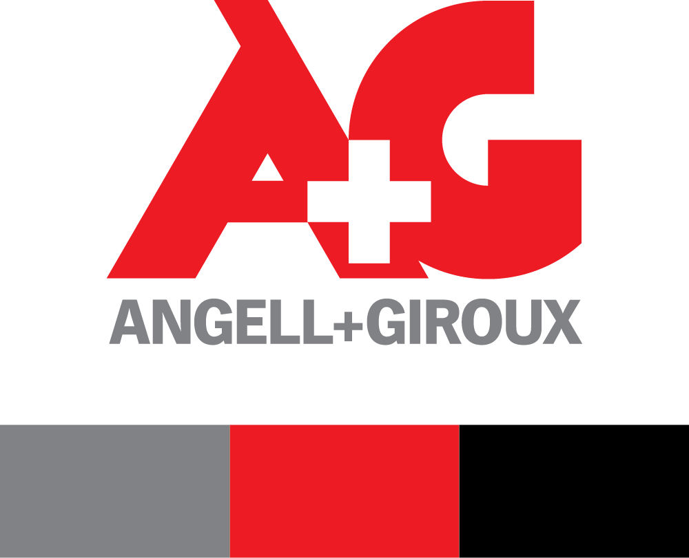


I drew this custom letter mark after researching some of Angell + Giroux’s original branding from the 1950’s. I also included the traditional plus sign and colors from first aid kits which is their main product. My main goal was to create something bold, clean, and scalable as I knew this logo would have to be used across print, web, embroidery, metal stamping, etc.
Kept it traditional and straightforward for the look and feel of all business papers to stay in line with manufacturing industry standards.
Set up this style and motif to reinforce the USA manufacturing and local Los Angeles business angle. I repeated the phrasing in the imagery and took custom photography of a more industrial side of the city.
I took two days and set up a studio at the manufacturing facility to shoot all new photos of every product line to update the website and bring awareness to new offerings.
A+G hadn’t had an update to their website in almost 10 years so I had plenty of room to improve the UX and UI of the site by implementing newer web best practices and doing competitor research. The site has never looked or performed better; traffic grows about 30% YOY on average.
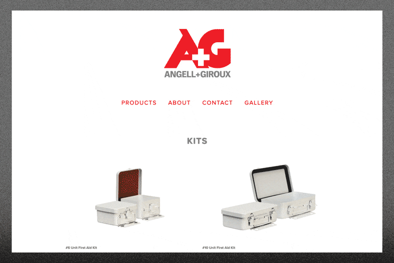
Used the crisp new product photography to create big, open, and scrollable product pages to clearly see the products and product info.
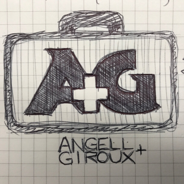
One of my first ideas sketched while going through the archives at their HQ.
Made this embroidery mock up to help the owner visualize one of the many possible applications.
The owner and team showing off some new swag.